RSS

Monthly Archives: October 2016

Review – Tarot Decoratif

Tarot Decoratif

Author: Ciro Marchetti
Artist: Ciro Marchetti
Independently Published
2016

img_1407

“A Tarot deck if a magical illustrated book like no other.
Every time you open its cover it offers you a different
and unique story.”

from the companion PDF

The Tarot Decoratif  is a 78 card deck that combines features from both the Marseilles and Waite-Smith schools of Tarot. It is self-published as a Special Edition, aimed primarily at collectors. The images follow traditional images close enough that the deck can be used easily for reading, if one is familiar with the Tarot. Marchetti is a digital artist, with several decks to his credit (Legacy of the Divine Tarot, Tarot of Dreams, Tarot Royale, The Gilded Tarot) – all of which are unique and outstanding in their own way.

img_1406

This Special Edition comes with a plethora of goodies – a signed signature card; a themed, satin lined bag; and a heavy, black, lift top box. (I am partial to black – I find the box stunning!) Reading cloths are also available for separate purchase. The option to personalize the card backs is no longer available, as the cards have already gone to the printer. There is no companion book, but there is a PDF available for download in which Marchetti describes the thought process (rational) for his personal design choices.

A small note about the PDF: I fully appreciate hearing the “story behind the story”. Seeing what is in the mind of the creator as he is creating. Those who have followed Marchetti’s work know that each of his projects is stand-alone, with vibrant energy and compelling story-lines. Many of us know that Marchetti had effectively “retired” from creating Tarot decks, and was focusing on Kipper and Lenormand oracles. He was nudged into changing his mind when he attended a presentation by Russell Sturgess at a TarotCon in West Palm Beach. Sturgess presented what to Marchetti was an entertaining and compelling view of the history of the Marseilles Tarot, the core of which was that its symbolic content was a “hidden in plain sight” reproduction of the religious beliefs of the Cathars, as expressed through the imagery of the Major Arcana. Hence, the interest to create a Marseilles based Tarot was ignited. To maintain the integrity of the deck, Marchetti reached out to a select group of people (including readers, publishers, authors, and artists of Marseilles style decks) that are acknowledged to be experienced voices in the world of the Marseilles Tarot.

Marchetti talks about the early woodcut decks, and how commercial appeal would have factored into the production of the decks. In designing the Tarot Decoratif, imagery from multiple decks was cross-referenced, as well as interpretations and views from various sources. The imagery that made the most sense was then chosen to be used. The result is imagery that is decorative, but still easily recognizable, and easily read.

img222


The Tarot Decoratif is a reflection of Marchetti’s personal style, and personal choices. While deeply imbued in the Marseilles style, there is enough imagery to make it interesting to those that find it a bit difficult to read with icons only.

While reading the PDF is not necessary to understanding this deck, I found it of personal interest. I did not agree with all of it, and you may not either, but it does give us insight into why the imagery in this deck is presented in the manner that it is.

img218

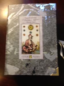
The cards are 3 ¼” by 5 ¼”, on a glossy card stock finish. There is a contrasting matt spot varnish over the outer border design. The backs have a black background, with gold inner borders and imagery, and are reversible. The card faces show a black background, with the same dual gold borders as the card backs. The Major Arcana (Trumps) show the card number, in Roman Numerals, centered at the top of the card. The card title, in French, is centered at the bottom of the card. The card of Death is numbered, but not titled.

The Court cards show the insignia for the character centered at the top of the card, with the card title and suit centered at the bottom of the card. The pips (numbered cards) show the card number, in Roman Numerals, centered at the top of the card, with the suit name centered at the bottom of the card.

img223


The card imagery is bold, with bright, intense colors. The pips are Marseilles style, with icons and no imagery, with the exception of a single image in the top, middle or bottom of the card. For example, the IV of Deniers shows the top of a male figure in the center of the card, with a shield beneath it. The X of Deniers shows treasure chest in the middle of the card, while the VI of Batons shows a rider seated on a horse centered at the top of the card.


img219


There is interesting symbolism throughout the deck, including three dice in mid-air in Le Bateleur, the Alepha and Omega signs on the page of the book in Le Pape, the cherub over the male figure in L’Amoureux, the flaming cauldron between the male and female figures in Le Diable, the family pictured in the IV of Batons, and the male figure appearing to study in the VIII of Deniers.


This is a vibrant, well done deck that would be a welcome addition to any Tarot collection, both from a collector’s point of view, and from a reader’s point of view.

© October 2016 Bonnie Cehovet
Reproduction prohibited without written permission of the author.

 
Leave a comment

Posted by on October 25, 2016 in Tarot


Tags: , , , ,

Review – Oriental Tarot (Tarocchi Orientali)

Oriental Tarot (Tarocchi orientali/Tarocchi Foudraz)

Edited by: Giordano Berti
English translation: Vic Berti
Images by: Claudio Foudraz
Araba Fenice S.a.s.
2016

img_1402

Giordano Berti has presented us with the reproduction of a delightful deck, created by Claudio Foudraz in 1845, in Turin, Italy. The original deck (in the form of uncut sheets) is preserved at the Academy of Sciences at Turin, which graciously allowed this reproduction. This is a Limited Edition of 700 copies, printed on a special “Vellum” paper. The deck was rediscovered by chance by Giuliano Cripps, president of the Italian section of the International Playing Cards Society. It was made public by Nicola De Giorgio in the Playing Card Magazine in 2014. The publisher commissioned an expert artist to add delicate watercolor consistent with mid-nineteenth century style. A comparison between the original and the colored version can be seen here –  https://rinascimentoitalianartenglish.wordpress.com/oriental-tarot-1845/.

The Oriental Tarot, or Tarocchi Foudraz, is a Chinese style deck, done in the manner of the Marseilles Tarot (pips are not illustrated).  Claudio Foudraz, through his research, reinterpreted many characters (in both the Triumphs (Major Arcana) and the Court cards). Berti also notes that even the pips have been reinterpreted, in both form and geometric arrangement.

The cards and 18 page companion booklet come in an amazingly special box done in a beautiful marbled gray, with silver inserts. (It looks exactly like a book!) It is held together on the side with gray ribbons that thread through a central eyelet. The inside of the box is done in a beautiful burgundy velvet. The booklet is a treasure in and of itself, where Berti shares his wisdom on the fashion of “chinoiserie” that inspired Claudio Foudraz in the creation of this deck.

img194-2

The cards are 2 5/8” by 4 5/8”. The card backs show a repetitive pattern of black images on an antique colored background. The backs are reversible. The card faces show a minimal white border, followed by a thin black line. The background is the same antique color as the card backs. The Major Arcana (Triumphs) show the card number in Roman numerals across the top, with the card title, in French, across the bottom. The Court cards show the card title across the bottom. The pips show the card number, in Roman numerals, either in the upper left and lower right corner, or in the middle on the right and left hand side of the card. The Ace and Deuce of Cups, the Ace of Deniers, and the Ace of Swords show no number at all.

The artwork and coloring are phenomenal! Basic line drawings with minimal background and soft coloring that does not detract from the image. La Papesse shows a female figure, seated, oriental style, with he hands folded into her sleeves, holding a rose colored fan. La Lune shows two castles, with a wolf and a dog between them, and a rose colored crayfish in the forefront, in the stream.

Le Monde shows a male figure, dancing on the world, holding a wreath in both hands. I love the Roi De Baton! We see a male figure, seated on his throne, looking to the left of the card. He wears yellow trousers, with spirals on them, an embroidered, rose colored tunic, and a yellow hat. A rose colored umbrella rises over him from behind. He holds his baton in his right hand.

The V of Batons and the III De Coupe both show a reinterpreted symmetry for the symbols.

The Cavalier De Denier shows a traditional pose, with the character on horseback, holding the symbol for the Denier in his right hand. The horse faces the left hand side of the card, with his head turned to face forward. The Roi De Coupe shows a male figure, seated, facing forward. He is wearing an embroidered blue tunic, with lavender trousers. In his right hand he holds a cup. A blue umbrella rises behind him.

img205

The interpretation for Le Pendu is quite interesting, showing a figure holding onto a line that has been strung between two poles. He wears a rose colored tunic, with yellow trousers and rose colored slippers. In his left hand he is holding something circular.

The booklet starts out talking about the European infatuation with Chinse arts and crafts, reaching its peak between the XVII-XVIII centuries. Berti goes on to talk about the impact that Chinese art had in France in the second half of the 17th century, and how the Chinese style reached Italy through the Piedmont region. The late 18th century was to see the rapid decline of the Chinese style in Europe.

Berti leads us through the history of Turin lithographer Claudio Foudraz, who produced both French playing cards and Tarot cards. The imagery for the French playing cards (which can be found on existing sheets), shows one sheet of 24 figures, 12 of which are done in the Chinese style. Berti reminds us that, rather than representing historical reality, these figures reflect conventional representations that were fashionable until a few decades earlier. The point is also made that similar imagery can be seen in the paintings of aristocratic and upper class mansions of the eighteenth century, as well as in furniture and porcelain decorations.

There is a short background given on Foudraz, along with an in-depth note section at the end of the booklet. I would also like to note that color images are used throughout the booklet.

I love paintings from the orient, the beautiful fabrics and the flow of both clothing and surroundings.  Here we see sumptuous embroidery on the silk dresses, reflective of the aristocracy and upper class in China in the 18th century and the early 19th century. It is an amazing, seductive deck that lives in a world of its own.

This is a collectors deck, not only because it is a Limited Edition (700 copies), but because of the companion booklet, in which Giordano Berti shares his knowledge of Chinese fashion as it relates to the Tarot. A beautifully done work of art, that is all about art!

While not a learning deck, it can easily be used by beginners to Tarot, as well as those that are well versed in Tarot lore.

© October 2016 Bonnie Cehovet
Reproduction prohibited without written permission of the author.

 
Leave a comment

Posted by on October 16, 2016 in Tarot, Uncategorized


Tags: , , , , ,